Saturday 12 June 2010
Tuesday 11 May 2010
Evaluation
Costing?
Bibliography
http://www.jimpattersonphotography.com/ - Jim Patterson- 10th may 2010
http://www.marcadamus.com/index.php -Marc Adamus 11th may 2010
http://www.stuckinphotos.com/ - Helga Kvam 10th may 2010
Photography skills and equipment research?
http://www.cambridgeincolour.com/tutorials/depth-of-field.htm -How to achieve depth of field?-9th May 2010
http://digital-photography-school.com/11-surefire-tips-for-improving-your-landscape-photography
-tips for landscape photography-10th may 2010
http://landscapephotographytoday.com/composition/ -How to compose a Landscape?-10th may 2010
http://www.locationworks.com/sunrise/instruct/index.html -Sunrise and set prediction research-11th may 2010http://www.luminous-landscape.com/tutorials/zone_system.shtml-zone system research-11th may 2010
http://www.talkphotography.co.uk/forums/showthread.php?t=141957-color cast research -7th may 2010
Images?
http://images.google.co.uk/imgres?imgurl=http://edfromct.files.wordpress.com/2009/04/vietnam-memorial.jpg&imgrefurl=http://edfromct.wordpress.com/2009/04/24/australias-day-of-remembrance-anzac-day-april-25th/&usg=__RvYA6ymdTurnYy-f4PJ5Rp994gM=&h=525&w=700&sz=74&hl=en&start=126&um=1&itbs=1&tbnid=RceHUwFE5ZYnRM:&tbnh=105&tbnw=140&prev=/images%3Fq%3Dwar%2Bremembrance%2Bwall%26start%3D105%26um%3D1%26hl%3Den%26sa%3DN%26ndsp%3D21%26tbs%3Disch:1
-Memorial wall image-18th march 2010
-Anorexia image-18th march 2010
-Shutter speed image-9th may 2010
Video's
-http://www.youtube.com/watch?v=DrtJ4d7rg3s –you tube-7th April 2010
Definitions?
http://en.wikipedia.org/wiki/Abstract_art -wikapedia -11th may
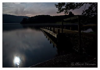
Windermere lake at midnight
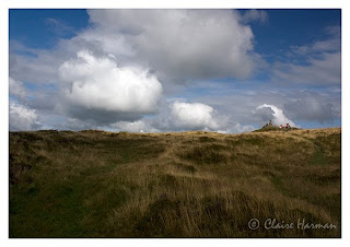
Windermere hill top.
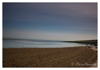
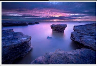
sun set beside the sea
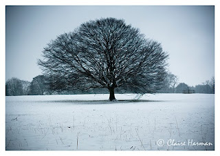
Snow covered tree.
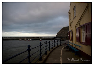
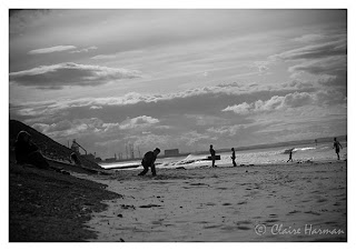
Saltburn Silhouette's
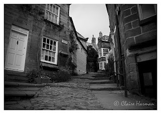
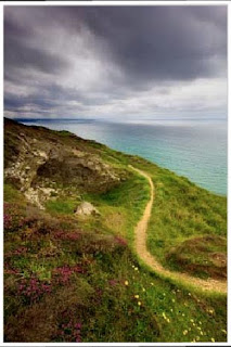
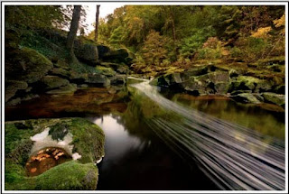
Robin hoods walk way
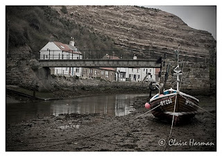
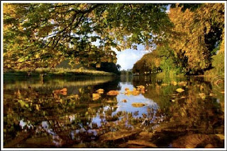
Fisherman's boat beside the river
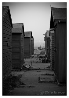
Desolate sheds
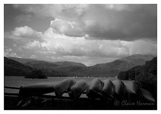
Canoes beside the lake
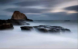
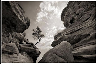
Abstract sea scape
Tutorial with Richard Whitehead.
I asked Richard if it was possible if i could enter images which i took a couple of month ago which fit into the brief(have been taken with the research i have practiced like filters shutter speeds,and depth of field). I didn't want to enter rubbish work when i had some brilliant landscapes at home not taken long ago. Richard said this as fine to enter the images i had taken a couple of moths ago providing I opened from fresh again and re-edited them from scratch which is what i did. In the next post i will post my final 10 images and explanations about my images and why i choose them.
Organised and visited day trips.
*Roseberry topping-got lots of photography of roseberry toping, surrounding landscape fields and surrounding
*North Yorkshire dales- drove through the country side looking for good imagery but didnt find any that day(the weather clouded over)
*Newbiggins-got lots of photography of rough sea against rocks and quirky little cottages.
*Robin hoods bay-Drove through robin hoods bay tried to get some imagery but wasn't much there although it was a gorgeous, got imagery of quirky cottages and walkways.
*Staiths-Got some great photography of landed boats, sun sets and the surroundings of staiths
*Whitby-got some imagery again of some rough sea.
*Runswick bay-again got some great imagery of rough seas and cottages.
I stupidly did not date when i went to these places so i couldn't really say when i went.So i know in future don't flap about all the work i have got and concentrate only on that but also date when i went out to get landscape photography and day trips.
Zone system research
| 1 | 2 | 3 | 4 | 5 | 6 | 7 | 8 | 9 |
| Low values Zone 0 | Complete lack of density in the negative image, other than film base density plus fog. Total black in the print. We will omit zone 0 from the remainder of this tutorial; zone 1 will be considered pure black. |
| Zone 1 | Effective threshold. First step above complete black in the print. Slight tonality, but no texture. |
| Zone 2 | First suggestion of texture. Deep tonalities, representing the darkest part of the image in which some detail is required. |
| Zone 3 | Average dark materials. Low values showing adequate texture. |
| Middle values Zone 4 | Average dark foliage. Dark stone. Landscape shadow. Recommended shadow value for portraits in sunlight. |
| Zone 5 | Clear north sky (panchromatic rendering). Dark skin. Gray stone. Average weathered wood. Middle gray (18% reflectance). |
| Zone 6 | Average Caucasian skin value. Light stone. Shadows in snow in sunlit snowscapes. |
| High values Zone 7 | Very light skin. Light gray objects. Average snow with acute side lighting. |
| Zone 8 | Whites with textures and delicate values (not blank whites). Snow in full shade. Highlights on Caucasian skin. |
| Zone 9 | Glaring white surfaces. Snow in flat sunlight. White without texture. (The only subjects higher than Zone 9 would be light sources; they would be rendered as the maximum white value of the paper surface. |
zone system research taken from: http://www.luminous-landscape.com/tutorials/zone_system.shtml
Definition of Abstract
Abstract art uses a visual language of form, color and line to create a composition which may exist with a degree of independence from visual references in the world.[1] Western art had been, from the Renaissance up to the middle of the 19th century, underpinned by the logic of perspective and an attempt to reproduce an illusion of visible reality. The arts of cultures other than the European had become accessible and showed alternative ways of describing visual experience to the artist. By the end of the 19th century many artists felt a need to create a new kind of art which would encompass the fundamental changes taking place in technology, science and philosophy. The sources from which individual artists drew their theoretical arguments were diverse, and reflected the social and intellectual preoccupations in all areas of Western culture at that time.[2]
Abstract art, nonfigurative art, nonobjective art, and nonrepresentational art are loosely related terms. They are similar, although perhaps not of identical meaning.
Abstraction indicates a departure from reality in depiction of imagery in art. This departure from accurate representation can be only slight, or it can be partial, or it can be complete. Abstraction exists along a continuum. Even art that aims for verisimilitude of the highest degree can be said to be abstract, at least theoretically, since perfect representation is likely to be exceedingly elusive. Artwork which takes liberties, altering for instance color and form in ways that are conspicuous, can be said to be partially abstract. Total abstraction bears no trace of any reference to anything recognizable. In geometric abstraction, for instance, one is unlikely to find references to naturalistic entities. Figurative art and total abstraction are almost mutually exclusive. But figurative and representational (or realistic) art often contains partial abstraction.
Definiton taken from: http://en.wikipedia.org/wiki/Abstract_artMichael Kenna


Michael Kenna so what do i like about Micheal kenna's work? I think he has studied the zone system very well and practices it very well. It is very obvious from his works, his black are the blackest of blacks set against the snow whites.I love Dark images and i think thats what attracts me to his work, because his work is so emotional and moody. I also like some of his images because they seem very abstract, like the image above. I have never really been keen on abstract art before but i seem to favor it within photography. I think i would like to bring some abstract work within my final 10 Images.
Marc Adamus


This is my favorite selection of work by Marc Adamus. I love marc's work definition on love. His compositions are exquisite and his colors are so strong and "contrasty". His compositions are well thought out and hi use of shutter effects are brilliant mac's work will have a big influence on my work, because i believe that he is a brilliant landscape photographer.
Images taken from:http://www.marcadamus.com/index.php
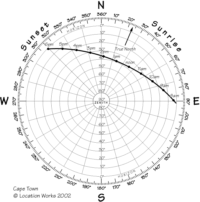
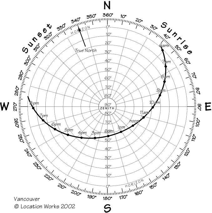
Sunrise and sun set predicition charts
Information taken from: http://www.locationworks.com/sunrise/instruct/index.html
Twilight is not measured in light intensity, it is determined by the sun's position relative to the horizon. There are three types of twilight (Civil, Nautical and Astronomical): the Twilight shown in the chart is Civil Twilight, which is defined as the time when the Sun is 6° below the horizon.
The Azimuth of sunrise/sunset is the compass bearing. North is 0°, East is 90°, etc. On the equinox (approx March 21st/September 21st), the sun rises due east and sets due west (all over the world). At other times, the sun rises north or south of due east.
The Altitude of the sun is measured from 0° on the horizon, to 90° at the zenith (the point of the sky directly above you). In the UK, in summer months, the sun will be seen to rise in the north-east, and as it travels clockwise it climbs higher in the sky until it reaches its highest point, at which point it is due south of the observer. From there it descends until it sets north-west.
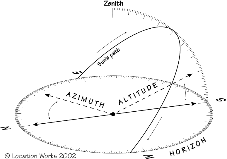
The Times and Azimuths shown assume a flat (nautical) horizon. The Solar Location Diagram can be used to determine the times/azimuths of sunrise & sunset in situations where the horizon is obscured. Determine the altitude of the obstruction, e.g. building or mountain, then use the solar location diagram to determine the time & azimuth of sunrise/sunset.
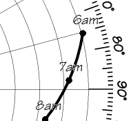
Example: let's say there is a mountain which has an altitude of 10° relative to the horizon. The concentric lines on the Solar Location Diagram represent 10° of altitude, with the outermost representing the horizon. In the example diagram shown left, the second concentric line - representing 10° - meets the sun's path when the sun is due East, at about 07:10.
Many countries use Daylight Saving Hours in summer, where the clock is moved forward/back one hour. If these hours apply, times will be shown on the chart followed by an asterisk.
Magnetic Declination is the term used to describe the difference between True North and Magnetic North. The Calculations shown in the Sunrise/Sunset Predictions have made an allowance for this difference, therefore the azimuths and altitudes shown are accurate to the readings shown on your magnetic compass. For an explanation, see: Geological Survey of Canada: Magnetic Declination and to find the declination for your area, see: GSC Canadian Geomagnetic Reference Field (you will need to know your latitude and longitude). If Magnetic Declination applies, this will result in an asymmetric path in the Solar Location Diagram: compare the diagrams below for the same day (August 1st) in Cape Town and Vancouver.
Monday 10 May 2010
Jim Patterson

Jason Theaker
Landscape photographer Helga Kvam

Landscape photography tips:

My first love in photography when I first got my trusty old Minolta SLR as a teenager was landscape photography. There’s something about getting out in nature with the challenge of capturing some of the amazing beauty that you see. Perhaps it fits with my personality type – but I loved the quietness and stillness of waiting for the perfect moment for the shot, scoping out an area for the best vantage point and then seeing the way that the light changed a scene over a few hours.
While I don’t get as much time as I’d like for Landscape Photography these days – I thought I’d jot down a few of the lessons that I learned in my early years of doing it. I’d love to hear your own Landscape Photography tips in comments below.
Landscape Photography Tips
1. Maximize your Depth of Field
While there may be times that you want to get a little more creative and experiment with narrow depth of fields in your Landscape Photography – the normal approach is to ensure that as much of your scene is in focus as possible. The simplest way to do this is to choose a small Aperture setting (a large number) as the smaller your aperture the greater the depth of field in your shots.
Do keep in mind that smaller apertures mean less light is hitting your image sensor at any point in time so they will mean you need to compensate either by increasing your ISO or lengthening your shutter speed (or both).
PS: of course there are times when you can get some great results with a very shallow DOF in a landscape setting (see the picture of the double yellow line below).

2. Use a Tripod
As a result of the longer shutter speed that you may need to select to compensate for a small aperture you will need to find a way of ensuring your camera is completely still during the exposure. In fact even if you’re able to shoot at a fast shutter speed the practice of using a tripod can be beneficial to you. Also consider a cable or wireless shutter release mechanism for extra camera stillness.
Related Reading – Introduction to Tripods
3. Look for a Focal Point
All shots need some sort of focal point to them and landscapes are no different – in fact landscape photographs without them end up looking rather empty and will leave your viewers eye wondering through the image with nowhere to rest (and they’ll generally move on quickly).
Focal points can take many forms in landscapes and could range from a building or structure, a striking tree, a boulder or rock formation, a silhouette etc.
Think not only about what the focal point is but where you place it. The rule of thirds might be useful here.
Related Reading – Focal Points in Photography

4. Think Foregrounds
One element that can set apart your landscape shots is to think carefully about the foreground of your shots and by placing points of interest in them. When you do this you give those viewing the shot a way into the image as well as creating a sense of depth in your shot.
Related Reading: Getting Foregrounds right in photography
5. Consider the Sky
Another element to consider is the sky in your landscape.
Most landscapes will either have a dominant foreground or sky – unless you have one or the other your shot can end up being fairly boring.
If you have a bland, boring sky – don’t let it dominate your shot and place the horizon in the upper third of your shot (however you’ll want to make sure your foreground is interesting). However if the sky is filled with drama and interesting cloud formations and colors – let it shine by placing the horizon lower.
Consider enhancing skies either in post production or with the use of filters (for example a polarizing filter can add color and contrast).

6. Lines
One of the questions to ask yourself as you take Landscape shots is ‘how am I leading the eye of those viewing this shot’? There are a number of ways of doing this (foregrounds is one) but one of the best ways into a shot is to provide viewers with lines that lead them into an image.
Lines give an image depth, scale and can be a point of interest in and of themselves by creating patterns in your shot.
Related Reading: lines in photography“>Using Lines in Photography (mini-series)
7. Capture Movement
When most people think about landscapes they think of calm, serene and passive environments – however landscapes are rarely completely still and to convey this movement in an image will add drama, mood and create a point of interest.
Examples – wind in trees, waves on a beach, water flowing over a waterfall, birds flying over head, moving clouds.
Capturing this movement generally means you need to look at a longer shutter speed (sometimes quite a few seconds). Of course this means more light hitting your sensor which will mean you need to either go for a small Aperture, use some sort of a filter or even shoot at the start or end of the day when there is less light.
 Photo by 3amfromkyoto
8. Work with the Weather
A scene can change dramatically depending upon the weather at any given moment. As a result, choosing the right time to shoot is of real importance.
Many beginner photographers see a sunny day and think that it’s the best time to go out with their camera – however an overcast day that is threatening to rain might present you with a much better opportunity to create an image with real mood and ominous overtones. Look for storms, wind, mist, dramatic clouds, sun shining through dark skies, rainbows, sunsets and sunrises etc and work with these variations in the weather rather than just waiting for the next sunny blue sky day.
9. Work the Golden Hours
I chatted with one photographer recently who told me that he never shoots during the day – his only shooting times are around dawn and dusk – because that’s when the light is best and he find that landscapes come alive.
These ‘golden’ hours are great for landscapes for a number of reasons – none the least of which is the ‘golden’ light that it often presents us with. The other reason that I love these times is the angle of the light and how it can impact a scene – creating interesting patterns, dimensions and textures.
10. Think about Horizons
It’s an old tip but a good one – before you take a landscape shot always consider the horizon on two fronts.
- Is it straight? – while you can always straighten images later in post production it’s easier if you get it right in camera.
- Where is it compositionally? - a compositionally natural spot for a horizon is on one of the thirds lines in an image (either the top third or the bottom one) rather than completely in the middle. Of course rules are meant to be broken – but I find that unless it’s a very striking image that the rule of thirds usually works here.
Related Reading: Getting Horizons Horizontal

11. Change your Point of View
You drive up to the scenic lookout, get out of the car, grab your camera, turn it on, walk up to the barrier, raise the camera to your eye, rotate left and right a little, zoom a little and take your shot before getting back in the car to go to the next scenic lookout.
We’ve all done it – however this process doesn’t generally lead to the ‘wow’ shot that many of us are looking for.
Take a little more time with your shots – particularly in finding a more interesting point of view to shoot from. This might start with finding a different spot to shoot from than the scenic look out (wander down paths, look for new angles etc), could mean getting down onto the ground to shot from down low or finding a higher up vantage point to shoot from.
Explore the environment and experiment with different view points and you could find something truly unique.
Information taken from:http://digital-photography-school.com/11-surefire-tips-for-improving-your-landscape-photography